Tutorial: UI Components
In this tutorial we will go through how to use some of the basic UI components provided by Zaplib:
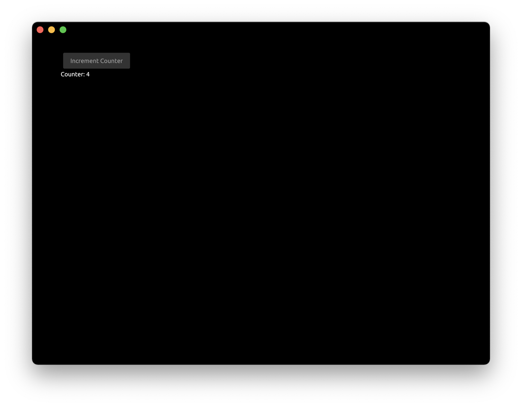
Step 1: Button
Let's create button that would be simply incrementing a counter.
Create a Cargo.toml with zaplib and zaplib_components dependencies crates:
[package]
name = "tutorial_ui_components"
version = "0.0.1"
edition = "2021"

[dependencies]
zaplib = { path="../../main" }
zaplib_components = { path="../../components" }
In main.rs include a library of components:
use zaplib_components::*;
Add a button and a counter to App struct:
#[derive(Default)]
struct App {
    window: Window,
    pass: Pass,
    view: View,
    button: Button,
    counter: i32,
}
Modify the draw function to draw the button and the value of the counter:
    fn draw(&mut self, cx: &mut Cx) {
        self.window.begin_window(cx);
        self.pass.begin_pass(cx, Vec4::color("0"));
        self.view.begin_view(cx, LayoutSize::FILL);

        cx.begin_padding_box(Padding::vh(50., 50.));
        self.button.draw(cx, "Increment Counter");
        TextIns::draw_walk(cx, &format!("Counter: {}", self.counter), &TextInsProps::default());
        cx.end_padding_box();

        self.view.end_view(cx);
        self.pass.end_pass(cx);
        self.window.end_window(cx);
    }
cx.begin_padding_boxadds the padding to application windowbutton.drawdraws the button with the given labelformat!creates the string with usingself.countervalueTextIns::draw_walkdraws the text on the screen
Modify the handle function to increment the counter when the button was pressed:
    fn handle(&mut self, cx: &mut Cx, event: &mut Event) {
        if let ButtonEvent::Clicked = self.button.handle(cx, event) {
            self.counter += 1;
            cx.request_draw();
        }
    }
button.handlereturns enum with possible events this component could trigger. We check if the button was clicked (ButtonEvent::Clicked). Other options areButtonEvent::Down,ButtonEvent::UpandButtonEvent::None.cx.request_draw()is called to re-render the application window.
After pressing the button for a few times we can see the counter value changing:
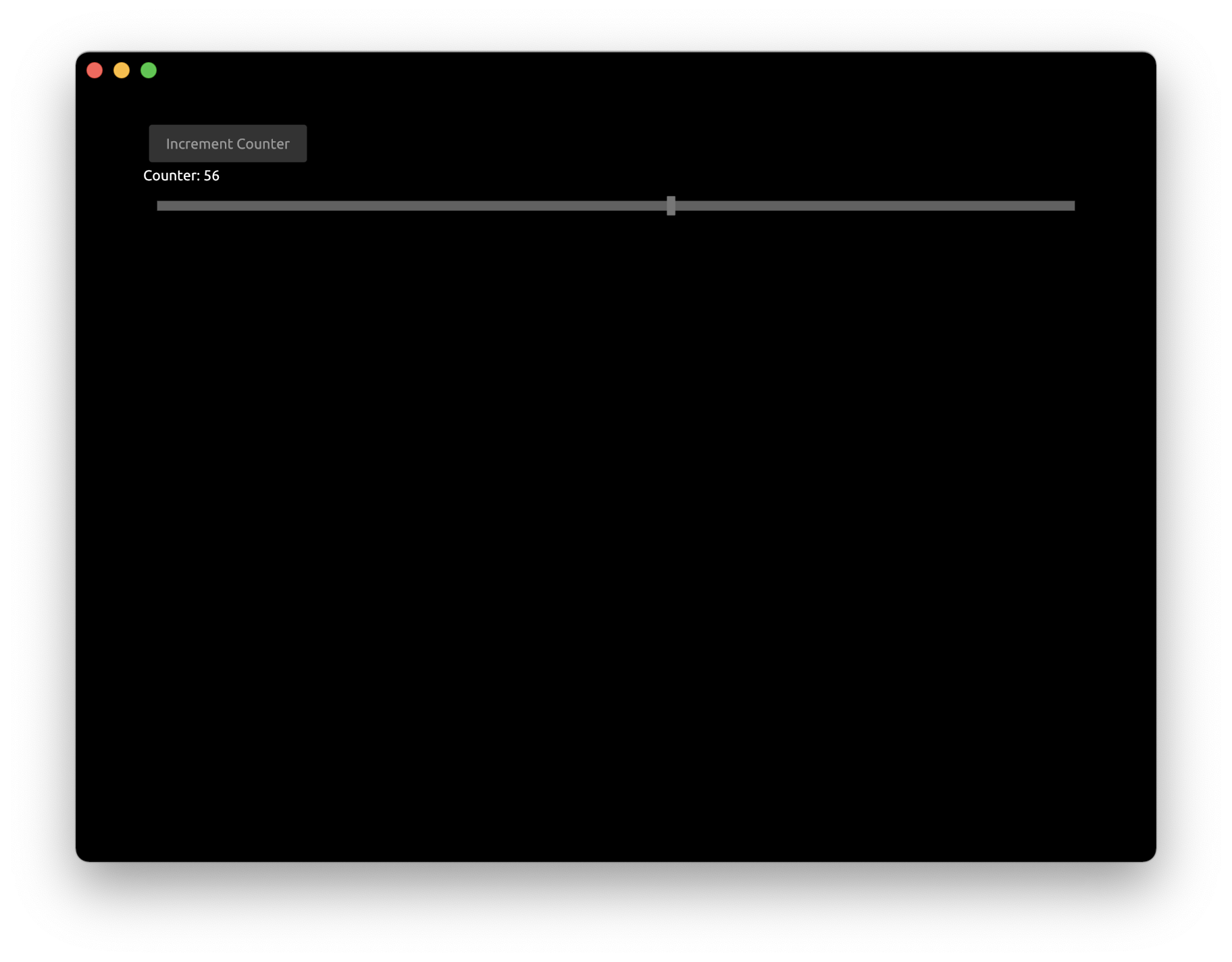
Step 2: FloatSlider
Now let's add the slider bar that would modify the same counter.
Add FloatSlider to App struct:
struct App {
    // ...
    slider: FloatSlider,
}
Draw the slider inside draw function:
        cx.begin_padding_box(Padding::vh(50., 50.));
        self.button.draw(cx, "Increment Counter");
        TextIns::draw_walk(cx, &format!("Counter: {}", self.counter), &TextInsProps::default());

        self.slider.draw(cx, self.counter as f32, 0., 100., Some(1.0), 1.0, None);
        cx.end_padding_box();
slider.drawdraws the slider with current position atself.counterin a0.to100.range with step increments of1.0.
Finally, connect the slider with the main application in handle function:
   fn handle(&mut self, cx: &mut Cx, event: &mut Event) {
       // ...

       if let FloatSliderEvent::Change { scaled_value } = self.slider.handle(cx, event) {
           self.counter = scaled_value as i32;
           cx.request_draw();
       }
   }
Now we can see that counter value is controlled by both the button and the slider:
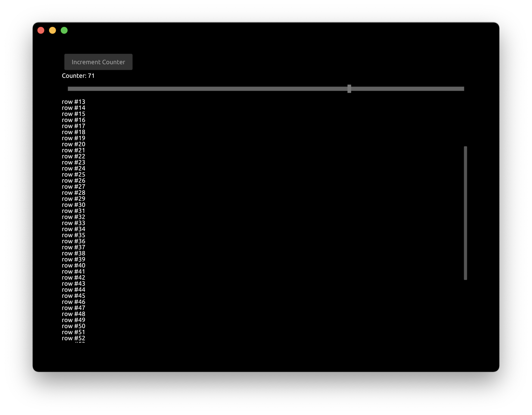
Step 3: ScrollView
To illustrate the usage of ScrollView let's draw some long text on the screen. Modify the draw function to draw rows equal to self.counter value:
        cx.begin_padding_box(Padding::vh(50., 50.));
        self.button.draw(cx, "Increment Counter");
        TextIns::draw_walk(cx, &format!("Counter: {}", self.counter), &TextInsProps::default());

        self.slider.draw(cx, self.counter as f32, 0., 100., Some(1.0), 1.0, None);

        for value in 0..self.counter {
            TextIns::draw_walk(cx, &format!("row #{}", value), &TextInsProps::default());
        }

        cx.end_padding_box();
As we can see the rows went beyond the bounds of the application window:
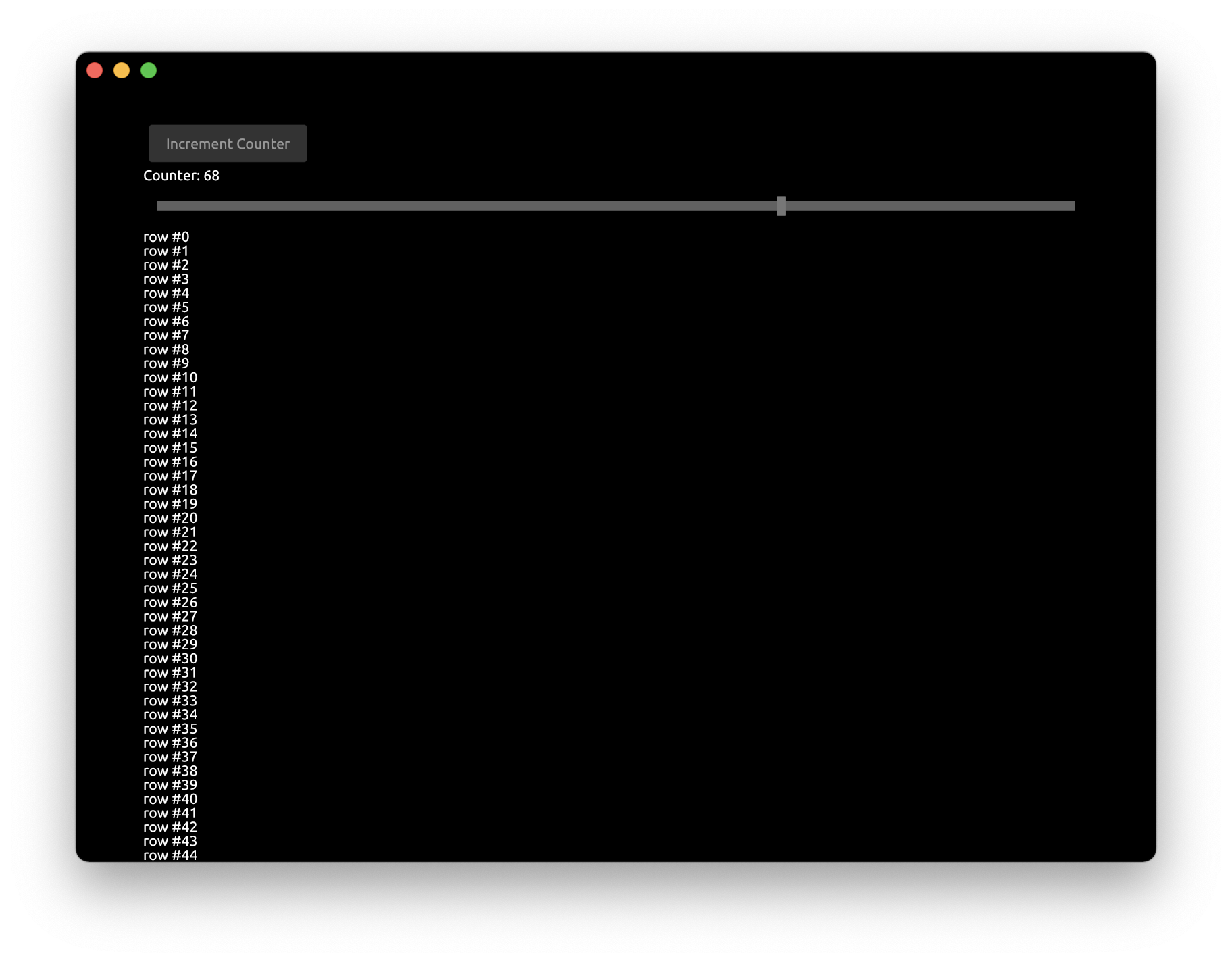
Let's fix this by adding a ScrollView component.
Modify the App struct to include ScrollView
struct App {
    // ...
    scroll_view: ScrollView,
}
Update the App::new constructor:
    fn new(_cx: &mut Cx) -> Self {
        App {
            scroll_view: ScrollView::new_standard_vh(),
            ..Self::default()
        }
    }
In the draw function add begin_view and end_view around the text drawing block
        self.scroll_view.begin_view(cx, LayoutSize::FILL);
        for value in 0..self.counter {
            TextIns::draw_walk(cx, &format!("row #{}", value), &TextInsProps::default());
        }
        self.scroll_view.end_view(cx);
Finally, update the handle function to enable scrolling:
    fn handle(&mut self, cx: &mut Cx, event: &mut Event) {
        // ...
        self.scroll_view.handle(cx, event);
    }
- We are not modifying the internal
App's state on scroll events, so we just ignore the return value ofscroll_view.handlecall
You can run this full example with Cargo:
cargo run -p tutorial_ui_components